Station.com
Sign In Join Free Why Join?
Sony Online Entertainment
Community Store My Account Help
  Search   |   Recent Topics   |   Member Listing   |   Back to home page
Riac's Image Thread.
Search inside this topic:
The Matrix Online » Top » Community » Residual Self-Image Previous Topic  |  Next Topic      Go to Page: 1 , 2 , 3 , 4 , 5 , 6  Next
Author Message


Systemic Anomaly

Joined: Oct 29, 2005
Messages: 4481
Location: Shinjuku Organization: Mero Faction: Les Enfant Terribles Server: Vector
Offline

I Tought id start one Ive allways wanted to do a bit more Photoshop related things for the game but never really get around to it.. i tought if i make a thread with my images and try keep it goin it might persuade me to do it a bit more often, So here goes 1st image.. You proboblayy have seen it before but here it is again just to kick the thread off..


Ive seen alot of these threads and normally read the usual "I like it becuase of the..." id prefer if u tried and maybe say whats wrong with it. at least that way i can put that knowlege towards the next one and there for i can inprove on my editing skillz >.<. Etc.. ^.^

Message edited by Riac. on 09/24/2008 18:38:57.


Fansite Operator

Joined: Oct 20, 2005
Messages: 357
Location: Unknown Instance: Vector-Hostile Org: Merovingian
Offline

supersdcurge wrote:
Ive seen alot of these threads and normally read the usual "I like it becuase of the..." id prefer if u tried and maybe say whats wrong with it. at least that way i can put that knowlege towards the next one and there for i can inprove on my editing skillz >.<. Etc.. ^.^

Well done.

Ikkaku and I thought the font was a bit too large. We also think the motion blur effect should be removed form the text.

It would seem that the MegaCity Populace is filled with talented designers. We find that very interesting.

/bowhead(X2)


Ascendent Logic

Joined: Mar 16, 2006
Messages: 4809
Offline

<_< Already know this picture. Either way, it's still as good as I last saw it.

Yeah the font is a bit too large.


Jacked Out

Joined: Aug 17, 2006
Messages: 676
Location: Mannsdale
Offline

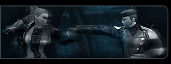
I like how you've given the image a sense of movement with the motion blur coming off your RSI, very nice. Another idea would be to use the free transform tool> rotate, its simple, and gives your piece a general idea of movement. You could also use the Radical zoom tool (A very ligt zoom, 10 -20) And that has a similar effect. Keep up the good work, buddy!


Systemic Anomaly

Joined: Oct 29, 2005
Messages: 4481
Location: Shinjuku Organization: Mero Faction: Les Enfant Terribles Server: Vector
Offline

It wasn't the greatest Clothing to have on this characther when i took the screenie but i said id give it a try .. i really like how the face came out myself,  ^.^


Message edited by Riac. on 02/10/2007 14:37:01.


Systemic Anomaly

Joined: Aug 17, 2005
Messages: 6800
Offline

Very nice work!

Great lighting.


Jacked Out

Joined: Apr 15, 2006
Messages: 1245
Location: Wonderland
Offline

I like.

- RedLynk


Systemic Anomaly

Joined: Oct 7, 2005
Messages: 4674
Location: HvCFT Everto
Online

Best advice I can give you on clothing, any lines you see on a peice, go over with a sharpen brush, make it so it stands out but isn't kind of white/sharp.


Systemic Anomaly

Joined: Nov 5, 2005
Messages: 5374
Offline

supersdcurge wrote:


WOW!   your short SMILEY


Systemic Anomaly

Joined: Oct 29, 2005
Messages: 4481
Location: Shinjuku Organization: Mero Faction: Les Enfant Terribles Server: Vector
Offline

imax wrote:
supersdcurge wrote:


WOW!   your short SMILEY
Rofl. this is True. Short but dangerous,..


Jacked Out

Joined: May 20, 2006
Messages: 7507
Offline

these are fantastic


Transcendent

Joined: Sep 1, 2005
Messages: 224
Offline

Nice stuff!


Systemic Anomaly

Joined: Oct 29, 2005
Messages: 4481
Location: Shinjuku Organization: Mero Faction: Les Enfant Terribles Server: Vector
Offline

This image came out way different than i thought it would, I started out editing the Character on the left making it more realistic looking, But after a while i realised the Glasses came out so rubbish in the screen shot i just gave up. i came up wit the idea of blocking off the face so i could still use it. I Really Love the darkness in this image.. i don't know why . I went way darker than Originally planned but yea. i like it.. its not heavily modified but i just like it as it is .. I was tempted to go further but way mess with Something that is just fine the way it is..?


From Darkness into the Light


Message edited by Riac. on 02/17/2007 16:49:50.


Jacked Out

Joined: May 20, 2006
Messages: 7507
Offline

Thats pretty.....amazing.. =o


Joined: Aug 15, 2005
Messages: 784
Location: HvCFT Revenant, Navigation Controls [Recursion]
Offline

Man, we need a good lighting tutorial. Everytime I try to use the dodge/burn tools, it always ends up greying it out.

Excellent work there. SMILEY It's make a good desktop if it were bigger. SMILEY
 
The Matrix Online » Top » Community » Residual Self-Image Go to Page: 1 , 2 , 3 , 4 , 5 , 6  Next
Go to:   

Version 2.2.7.43